When beginning to build your blog, you need to think critically about the appearances and your personal preferences when selecting specific blocks for construction. Some building blocks are harder to change once you have started or have a blog already well used. Making changes are not impossible, but some are easier to swap out if they are similar in style.
Let’s Explore
Let’s begin with an activity where you can ‘see what you see’ on these selected blog sites. We’ll look at two blog sites to identify what design choices and options impact the appearance of the sites. These are examples for design considerations (what they did and how they did it) that I noticed. What do you see that I didn’t see?
- BC TEAL Blog (The Official Blog of the Association of Teachers of English as an Additional Language) [powered by WordPress]
- compliments and supports the BC TEAL website and links from the website
- models use of left side widget panel; includes a search option; has a category selector; has a dropdown archive selector
- includes blog guidelines; respectful interaction guidelines; content policy; copyright information (CC BY-NC)
- made a design choice to include a pattern background behind the text frames with light background and dark lettering; images at the top of each post
- Fun in Fourth (site of BC teacher Angela) [Powered by Blogger]
- header topics and text/font style
- footer of a row of dots to indicate the end of a post; consistent way to sign off at the end of a post (less formal)
- includes option to comment through a Google email account
- includes a privacy policy page with definitions specific to this blog site (Why would this be needed for this blog?)
- models the use of the right side widget panel that includes ‘about me’; connect with me through social media links; embedded Pinterest; email option; search option; archives by date & month; Find it Fast tag word cloud;
- a ‘back to the top’ button on the right side panel (supports user navigation)
- has a footer widget panel with a ‘visit me on Instagram’ link and subscribe to a mailing list option.
- Cult of Pedagogy (Jennifer Gonzalez)
- Menu is located at the top of the page, justified to the right side of the page
- Has a ‘start here’ option in the menu
- Initial content presents some critical navigational information
- Image/buttons lead to curated posts based on categories
- Widget at the bottom of the page lists all the topics (would be the categories for each blog) with a number of posts within that topic
- Footer on the page includes copyright and social media links
- Culture of Yes (Chris Kennedy)
- Right side widget panel includes a ‘follow me’ option; link to twitter feed; recent posts widget; categories widget; past posts by month;
- Full blog post is visible, results in extensive scrolling down a never ending page
- Each blog post has categories and tags identified at the bottom of the post
- Comments are present but not visible, need to open comments by clicking on the link – if you do, you see other bloggers who liked the post and related previous posts by date
Design appearances also impact the views you may get when accessing the site from a mobile phone or tablet, so test as you build. WordPress gives you a PREVIEW option in the top right corner where you can select the view you wish to test.
Getting to know the Dashboard
The dashboard is the starting point for your actions and options for the blog site. When working on pages or posts can view the left side menu at any time by clicking on the WordPress logo in the top left corner. Be sure to save or update your page/post before moving to the dashboard.

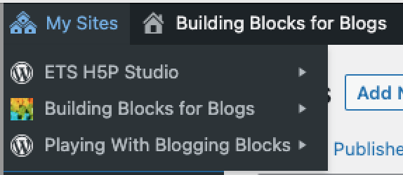
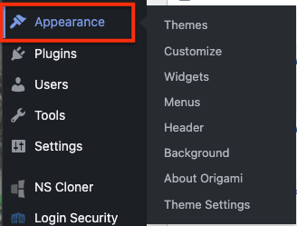
From the dashboard, you can access other blog sites you may have under your account. From the dashboard you can access the APPEARANCE menu options.
Part of the top level dashboard options includes a drop down menu under the blog site name for quick access to the dashboard, themes, widgets, and menus.


On the next pages we’ll look at WordPress design options (themes, widgets, menus) as well as general web publication considerations.